Contract disclosure is a keystone of transparency and good governance in the extractive industries. Since 2021, the 55 countries that are members of Extractive Industries Transparency Initiative (EITI) have been required to start disclosing contracts.
Over 8 months we worked as a small team with PWYP, Oxfam and the NRGI to design a simple and easy to use visual tool, that shows how EITI member countries are performing with regards to the disclosure of oil, gas and mining contracts.
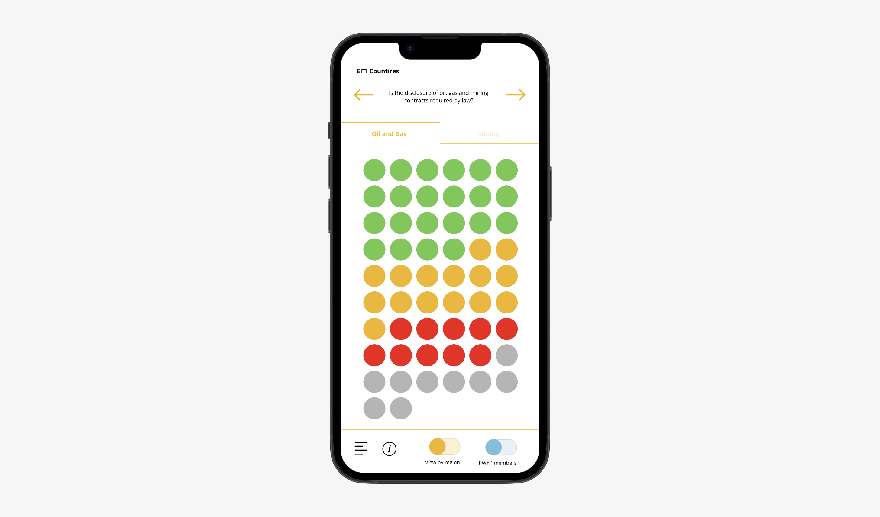
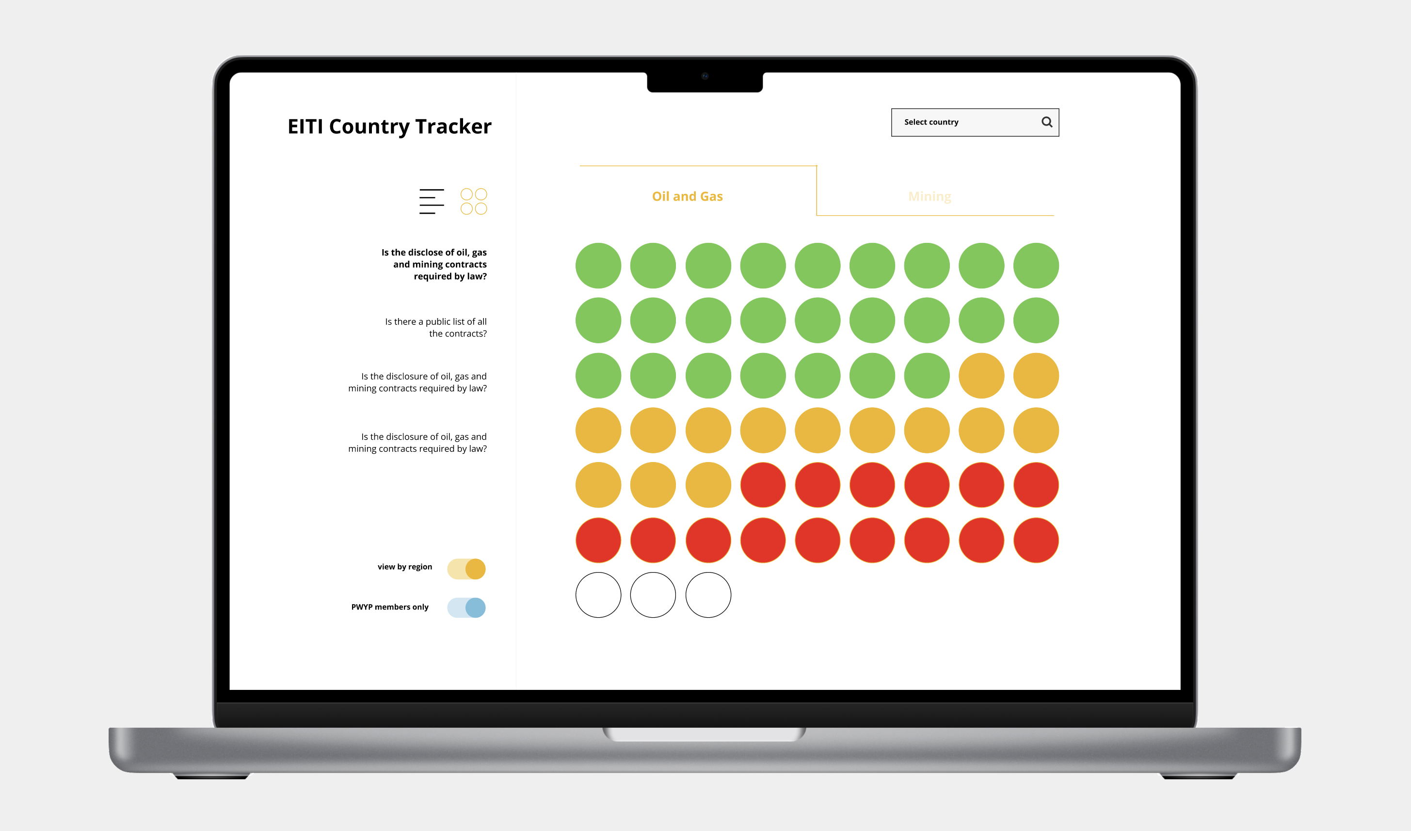
Working from data sets meticulously compiled over the past year, and using four key metrics to explore the data, it offers users a simple and intuitive way to view the records of each member country.
Immersion into the issue
We began by immersing ourselves in the issues: the politics, practicalities and challenges of contract transparency around the world. The PWYP team knew the project inside out, who their audiences were, and exactly what they wanted to tell them.
This research helped was critical to the project’s success, and helped to understand what would be most beneficial to their audiences, what tools they would use to access it, and how best we might develop a visual language that would show the information clearly.
The initial plan was to create two separate tools, one that would display the data of the 55 member countries in the EITI , and another that would show what each PYWP member coalition advocacy goals were to try meet full contract transparency.
Above: Initial concepts for the two tools
Designing an intuitive tool
Through further conversations with the teams from PWYP, Oxfam and NRGI we established early on that the tool needed to be accessible across low-bandwidth areas, and that we should focus on mobile. As a lot of the potential users would be in the global south most access would be from mobile devices, so we wanted to ensure that we were able to create something lightweight and functional that would be simple to use.
Once we had had defined what exactly would be the metrics used from the data to present the findings, and after further discussions with the client, it was clear that we could manage everything in one visual tool, rather than the need for two.
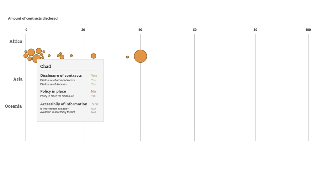
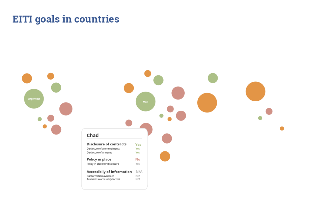
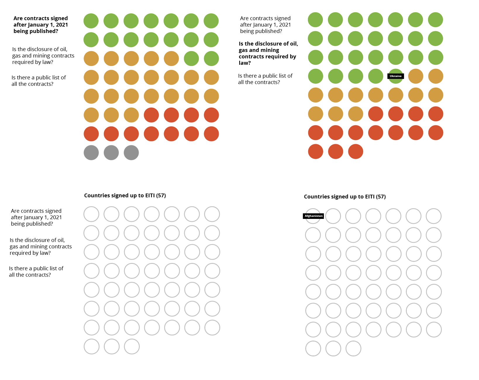
With the exact data defined, the next step was to create an intuitive visual language that would be understood across a diverse range of cultures and people. After much work offline and discussion amongst the team, we developed a simple ‘traffic light’ concept, that would show it a simple way which countries were performing well, which still had work to do, and which were underperforming.
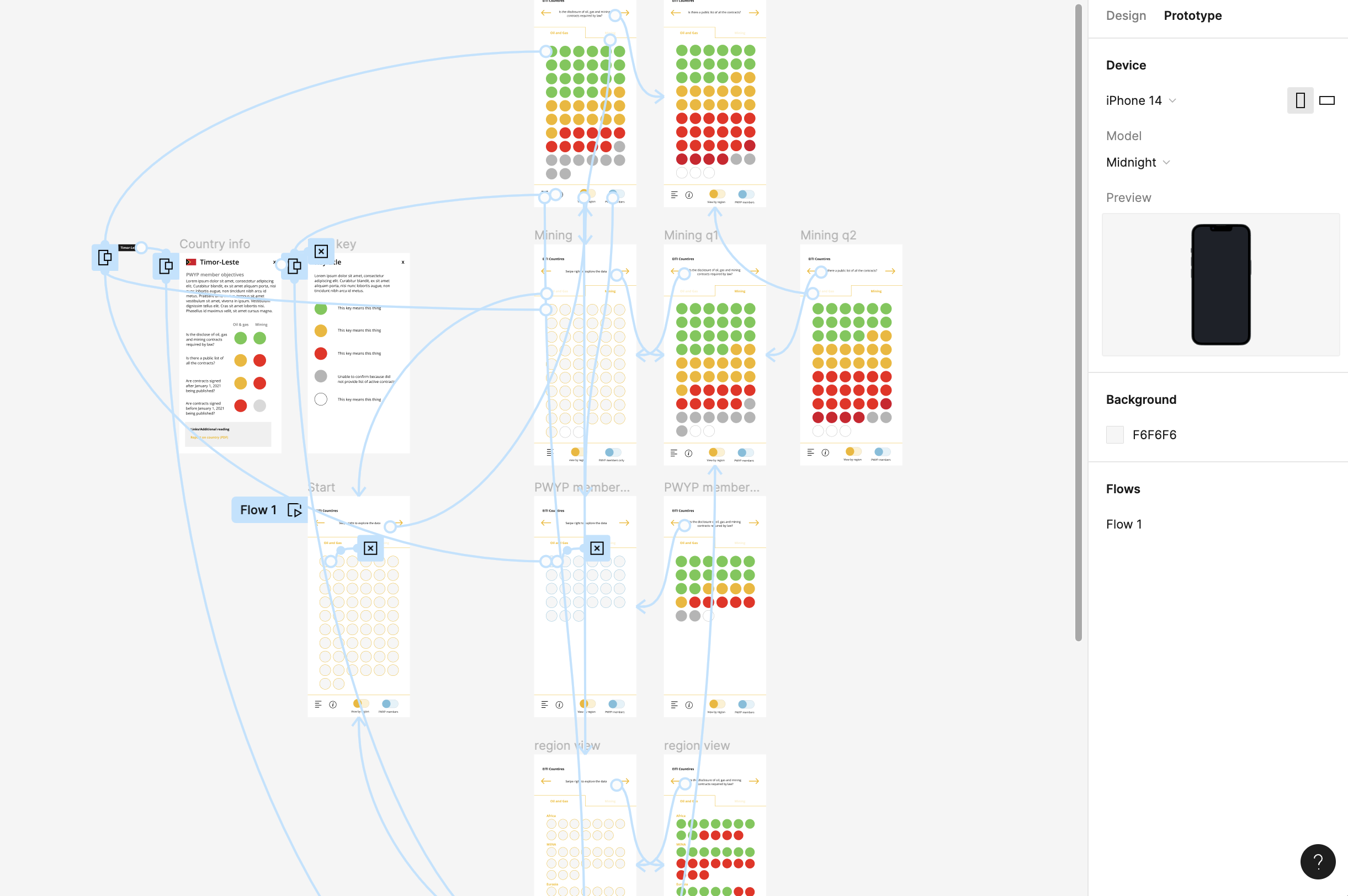
With the basic visual style in place we then focused on the UI of the tool; how the data could be explored with different views (both as a list and visually), and different ways to explore the data (a simple country search or by region). By creating a prototype in Figma this helped to show the teams at PWYP, Oxfam and NRGI how a user would interact and explore the tool.
Building the backend
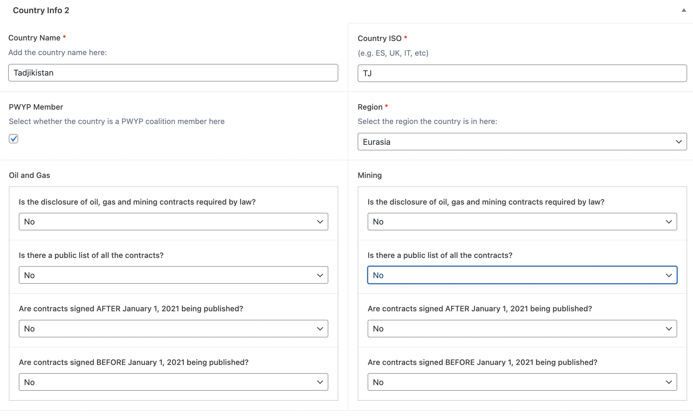
The data set consisted of 3 clear questions, and for each there were 4 simple choices, ‘yes’, ‘no’, ‘Partially’ and ‘N/A’. Each would be represented by a colour; YES (green) PARTIAL (orange) NO, (red) and N/A (grey).
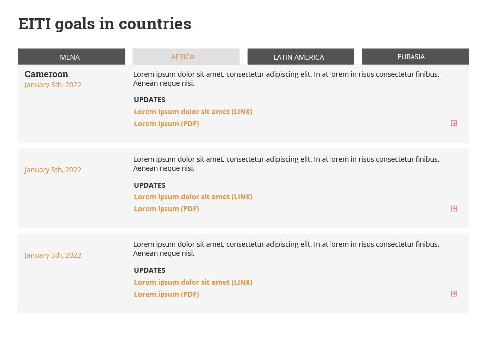
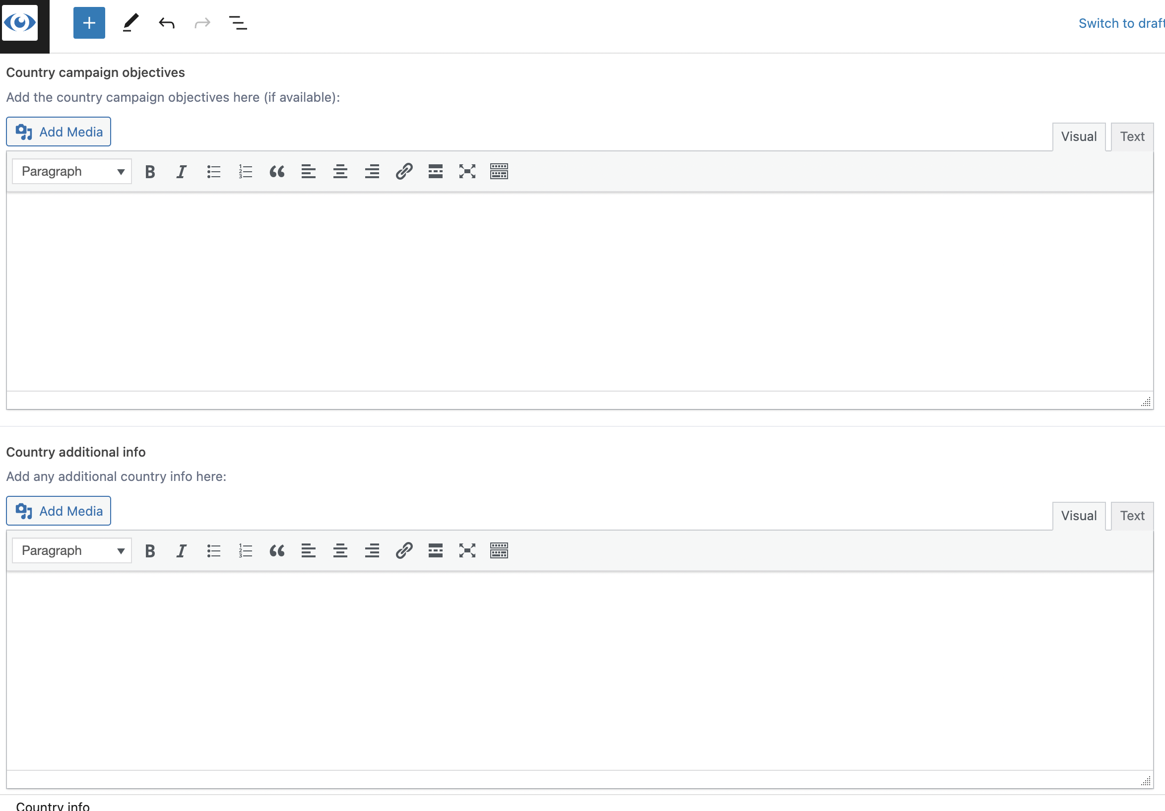
Using the existing WordPress structure the original site was built in, we wanted to ensure updates could be made easily to the tool in the future by the PWYP team. For this to work well, and across five languages, we created Custom posts types (CPTs) for every country (image below). Each contained simple for fields to fill in the data per country.
Interactions and mobile first
Working closely with a frontend developer we started to build a workable prototype from the a sample dataset, based on the Figma files. As we would be creating the tool with a mobile first approach, it became clear that we could use some interactions, such as a ‘user swipe’ that would provide us with more real estate to display the data while still maintaining a simple intuitive navigation.
Refining and polishing
Constantly involving the teams across the project, it gave us the opportunity to test the tool as it involved and refine it, improving options, iconography, and the overall user experience, which ultimately led to much clearer and better final product.
Final takeaways
Since the visual tool was launched it has been incredibly well received by PWYP members across the world and inspired the EITI themselves to create a similar tool for themselves.
Key to the success of the project, was the collaborative approach taken with all the teams involved to ensure the end product met the original goals of the project. Working within a tight budget meant we had to work smart and iterate rapidly.
Ultimately, we achieved everything we set out to do with the tool and believe it can provide real benefits for advocacy and activism work on the ground and help to ensure good governance further transparency and contract disclosure across the world.