When redesigning and rethinking the TUSGSAL website, (the web of the second largest bus network in Barcelona) my goal was to solve the obvious usability issues, which I managed by increasing usage by 370%.
However, it fast became larger than I originally imagined and my lack of experience in creating a multi-lingual, scaleable site, meant I would ultimately fail to achieve a product that would stand up to the test of time. It lasted for a good 10 years, but new technologies and practices made it understandably obsolete.
Observations and understanding the Users
From a simple design point this site wasn’t pretty by any means, although that wasn’t the initial observation I had. What I noticed most was a site that seemed to act, not for the end user, but as an overview of who the company was.
Instead of providing the same quality service the bus network itself produced, it seemingly ignored its position as a tool to aid it’s customers understand and use the network.
This was nowhere more apparent than on ‘Nuestros Servicios‘ page (below)
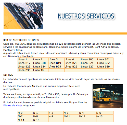
The page, taken for a new users perspective was an almost impenetrable mass of numbers and data, which without prior knowledge of the service, meant you were left to click on every bus line individually until you found the route you were looking for. Not exactly the service you expect from a transport company who’s livelihood is made from getting people from one place to the next.
What I needed before starting to create something new was an understanding of how people were using the site, and what I found wasn’t great.
Delving deeper
From looking over the analytics for the previous year there were less than 20 people using it every day across three different languages. An incredibly low number for a transport service that served over one million people per day.
This gave me the leverage I needed to start building a site that I felt would ultimately provide a greater level of service to TUSGSAL’s users.
With the benefit of hindsight, we should have conducted a short survey across the network on what customers felt the site should contain. However, with limited resources and my level of catalan and spanish at the time, we went ahead without this.
Design and development
My only prior experience in online design, at that point, was solely in creating small but functional websites and my CSS and HTML skills were somewhat rusty, so I needed to create something simple, intuitive and above all, easy to use. As well as, from my side, easy to build from a developmental point of view.
I designed the basic flow of the site, based on the universal belief at the time, that a user should never be more than 3 clicks from the information required. Therefore, the main starting point would be with the main information that any user would be looking for on a transport site; the service.
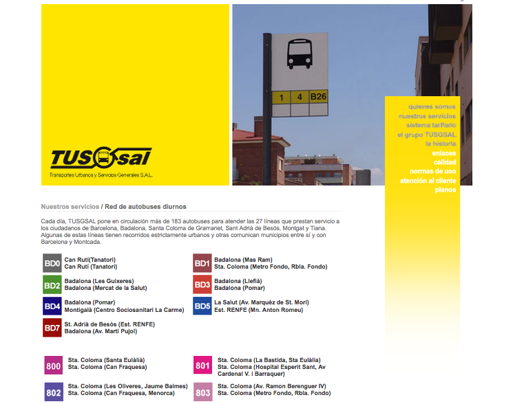
By using the colour coded guide to different lines, which already existed in printed materials, I wanted to unify both, so existent users of the service would recognise the information they needed quickly and easily. For new users, I included the start and end points for each line on the initial page, and each was linked to the EMT’s website (an external website) which showed the full line, as well as any interruptions to the services, which were updated regularly.
Partly, I designed it this way due to both financial limitations and my own inexperience as a developer. The ideal for this page would have been to include a search facility for each user based on their journey, letting them choose a start and endpoint and providing them with the best route to take. However, the lack of a database and resources, (It was just me) meant that I had to find the alternative solutions.
Additional improvements
Across the site my focus was on improving content and making it easy to use, so each user could be better informed on all of TUSGSAL’s services.
For the main menu I split the content by colour, with the idea being that the highlighted information would be the most relevant to any new or existing user.
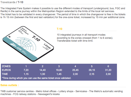
The original site also provided a guide to the tickets available, but again, did not provide any useful information. Therefore for each I created a table of costs, what the difference of each ticket meant, and where to purchase them.
Limitations and issues
As I’ve mentioned throughout this case study, there were many limitations and issues that I became aware of early on, none more so than my own to build something that was closer to my initial vision. However, what I managed to achieve was a site that now had value and could give (at the very least) useful information to users.
With greater financial support and resources we could have built a scaleable and sustainable site, but my lack of knowledge and eagerness at the start the project blinded me to how much work I had taken on.
The sites over reliance on third party providers (EMT and TMB) meant that any changes of their respective sites could renders ours useless. Linking directly to content was a short-term solution and would not be sustainable in the long term. It also meant that our analytic data was skewed as people would leave the TUSGSAL website whenever they clicked through to these providers information. Meaning the data would ultimately provide little insight as to user drop-off.
No content management (CMS)
Or lack of, meant that I was maintaining and updating the site with new campaigns, news and pricing changes on a regular basis. With a CMS system in place I would have been able to train and delegate this to others, bringing in people from inside TUSGSAL’s network who could provide support and help it’s growth within the company.
Learnings and conclusions
I did achieve some of what I set out to do, as after the first two weeks of the new site being live, daily usage had increased 370%, and the site was now getting an average of over 300 users a day who, on studying the analytics where drilling down to the content I had initially assumed would be of most interest.
However throughout the process of development I was often blocked by my own limitations to be able to create something truly useful. The knowledge I started with meant I was unable to see these issues before they became apparent and had to resolve them as best as I could at the time.
With greater insight, knowledge and more resources it could have become everything I imagined and more. Instead I had to settle with an large increase in traffic, which considering I design and built everything myself made the project a success.